
Phoenix Restaurant
Branding, Packaging, Illustration, Art direction — 2019
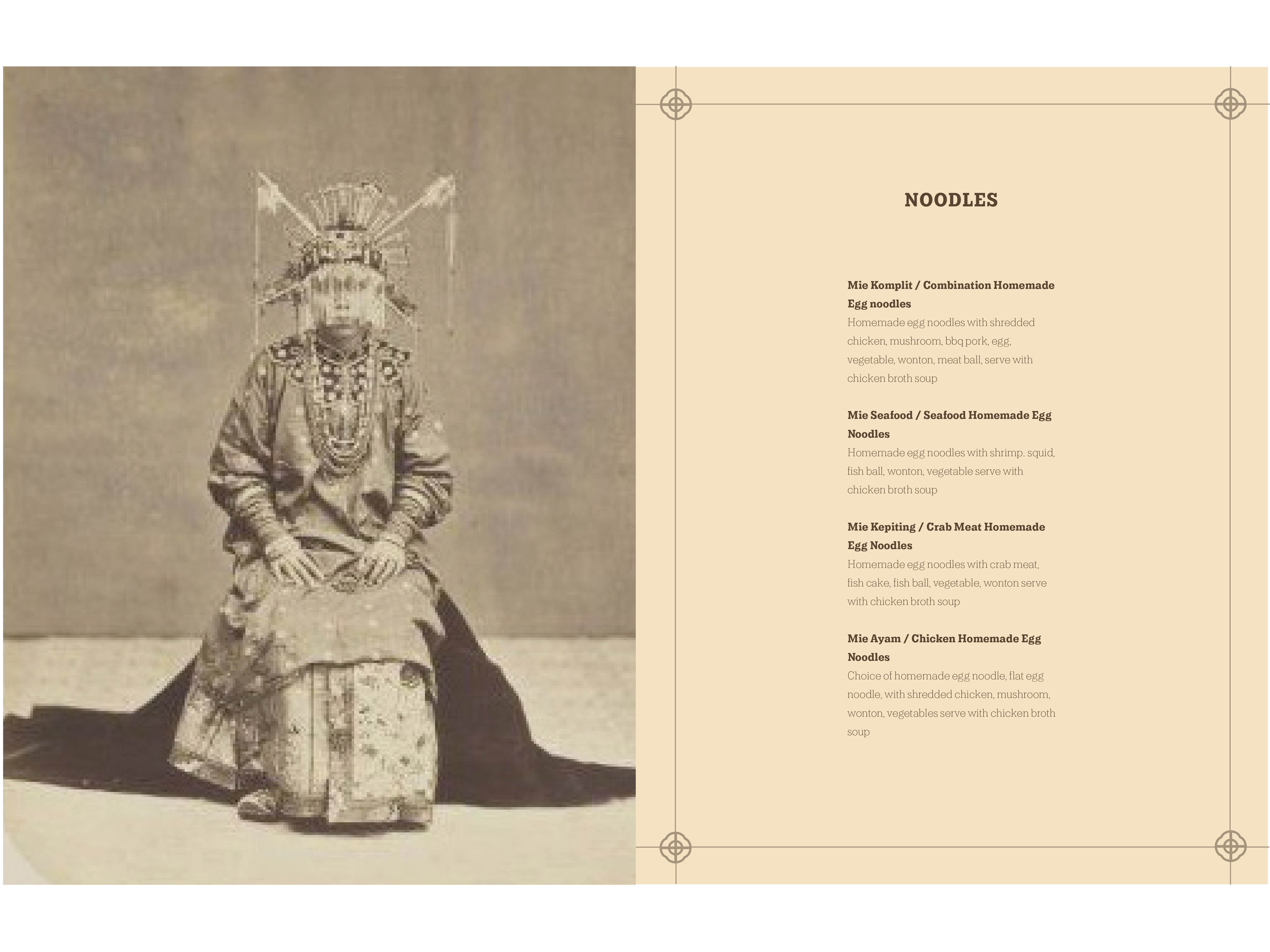
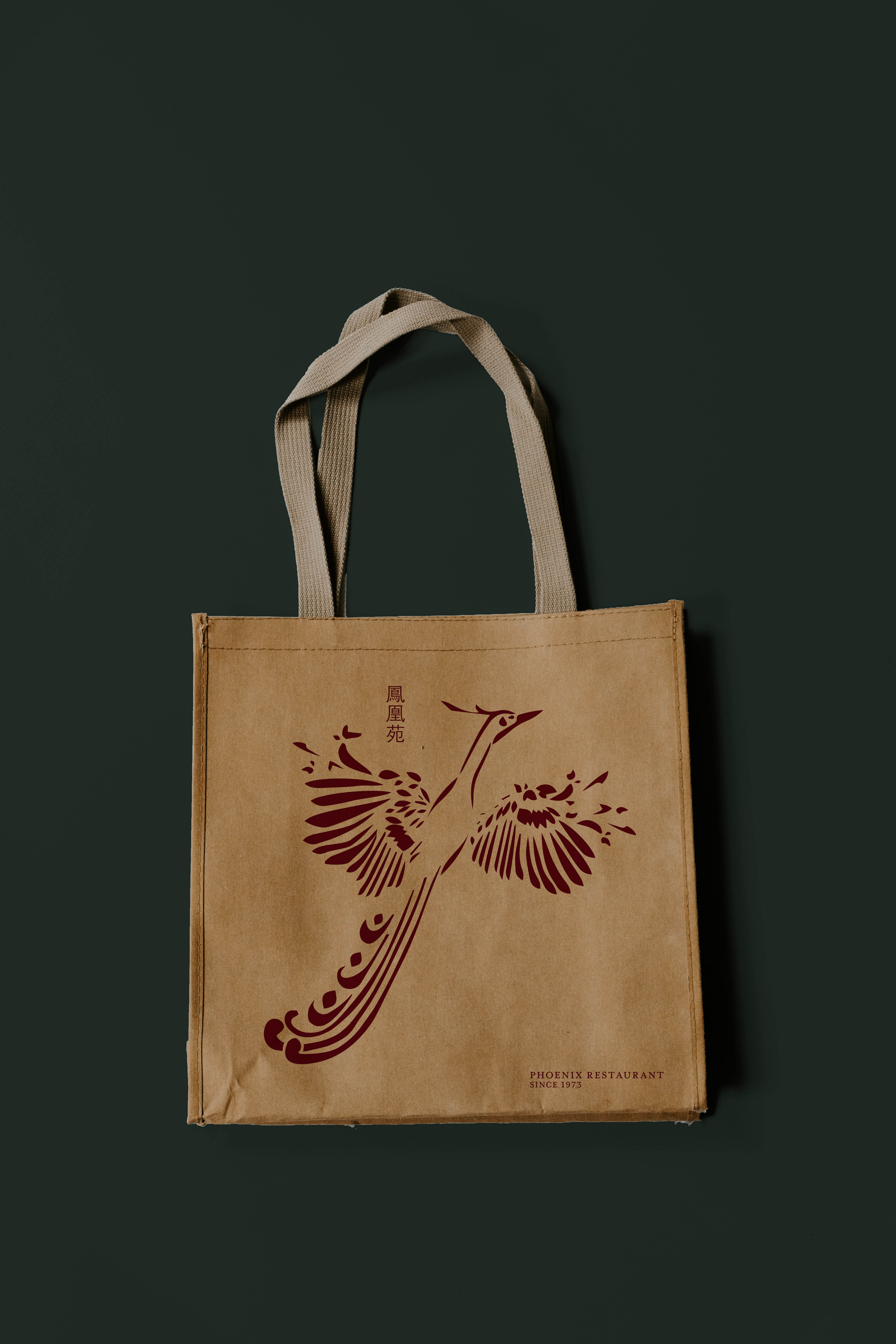
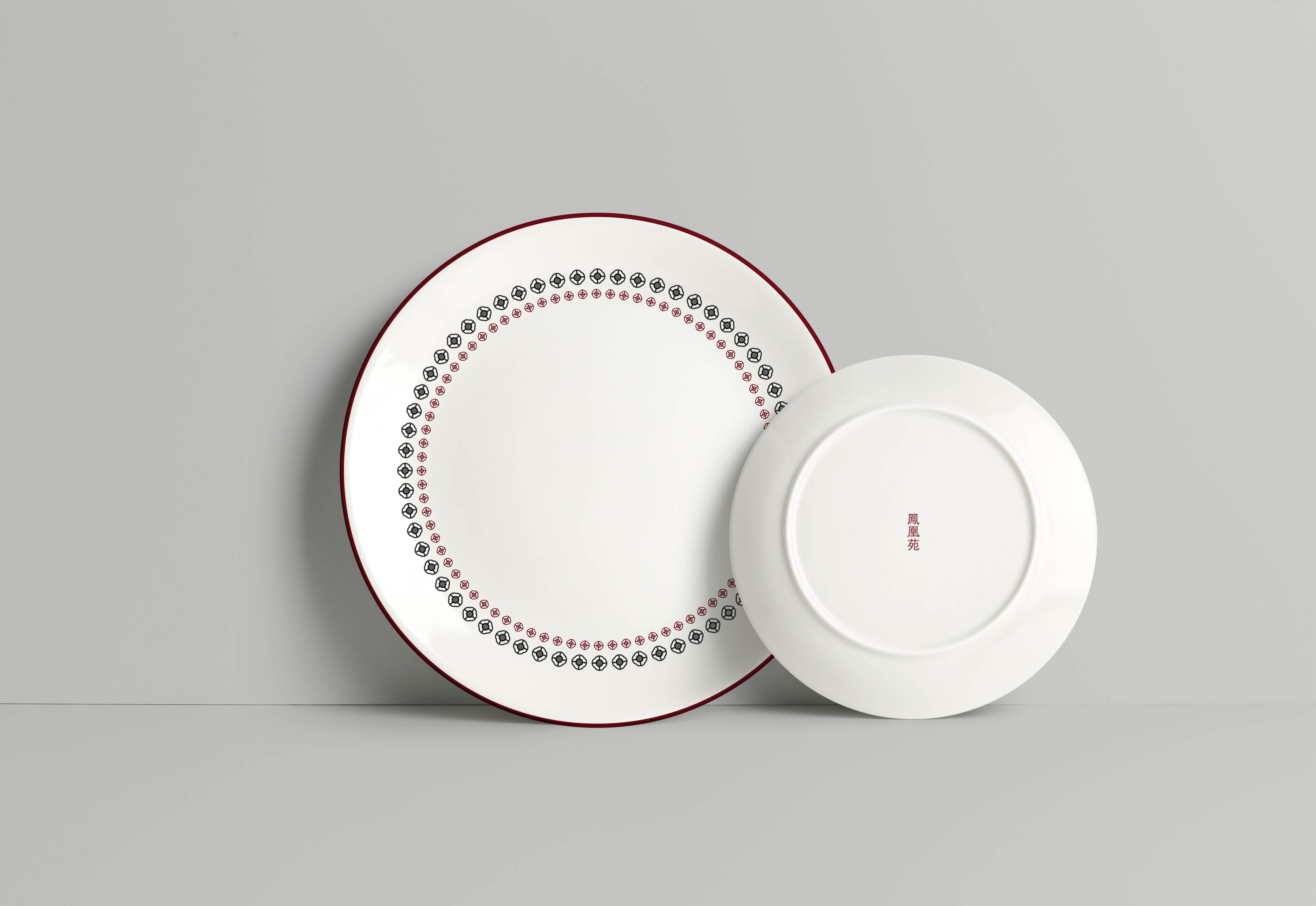
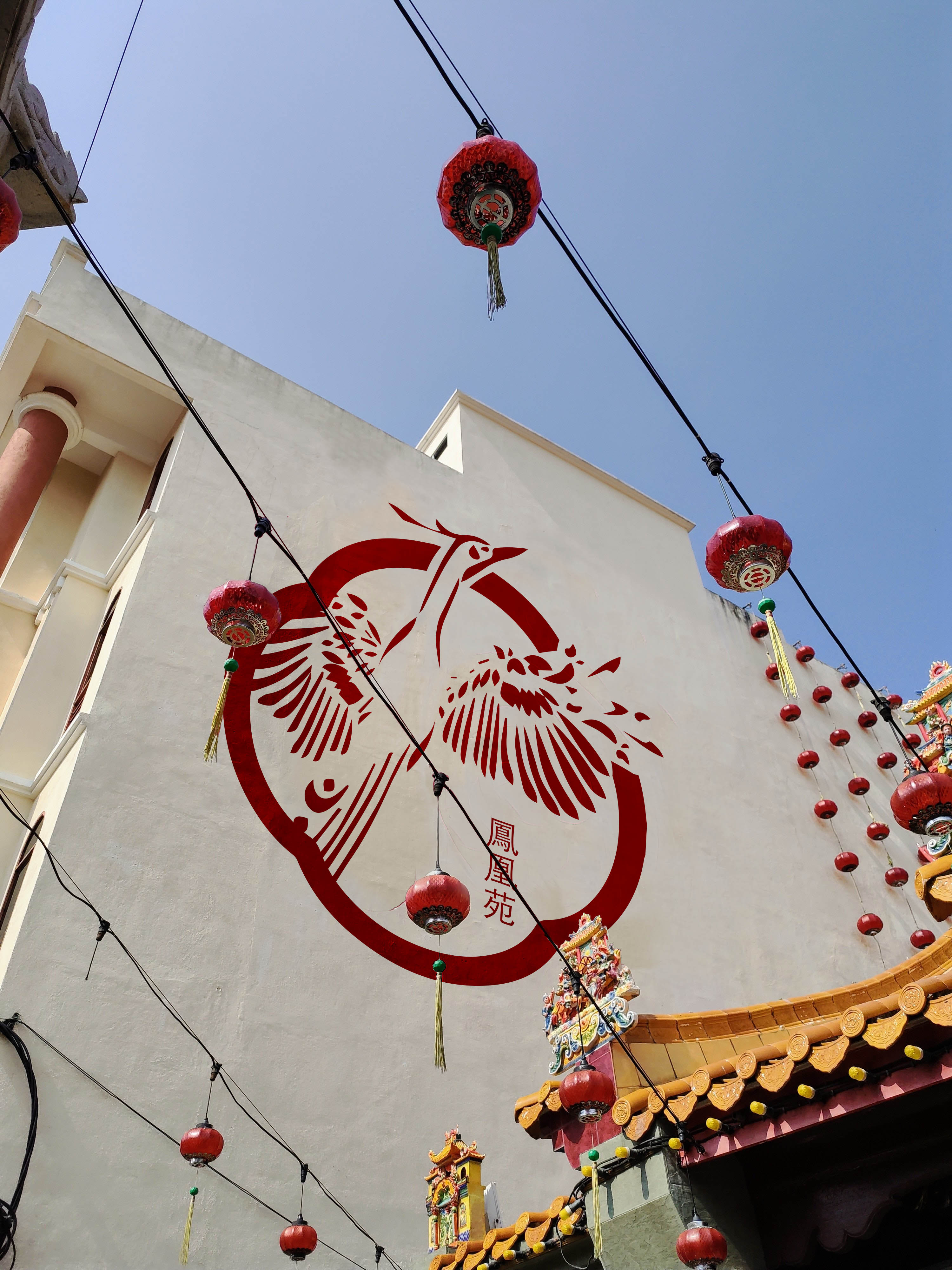
Phoenix Restaurant is a family-owned restaurant in Surabaya, Indonesia that once serviced more than 1000 people a day and needed a new visual identity, including branding, packaging, business cards and plating for their re-opening, after having been closed for more than ten years.
The new identity was focused on a more sophisticated aesthetic, while maintaining the character and heritage of their original brand. This was accomplished by using elevated and completely redrawn graphic elements paired with modern type to reflect the new Phoenix.


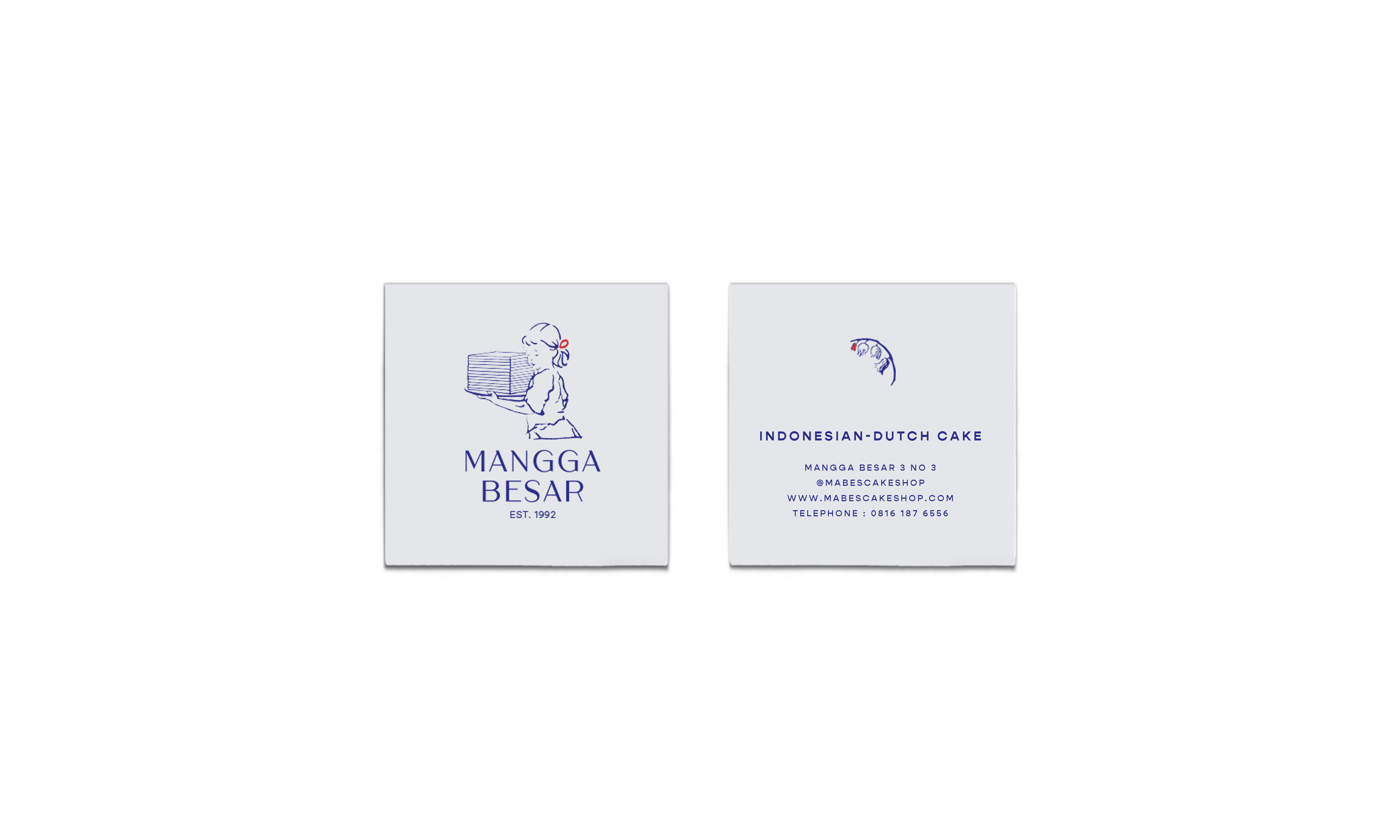
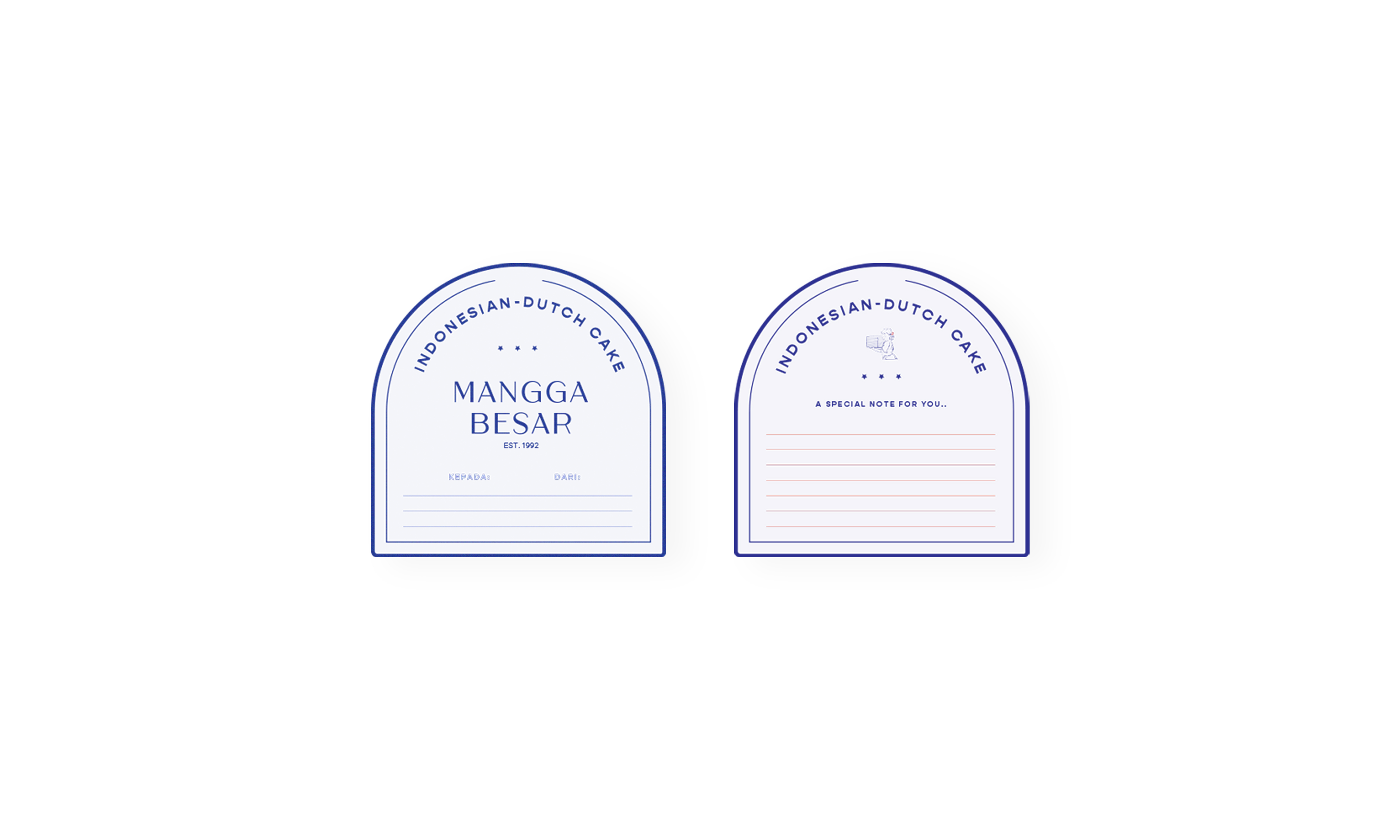
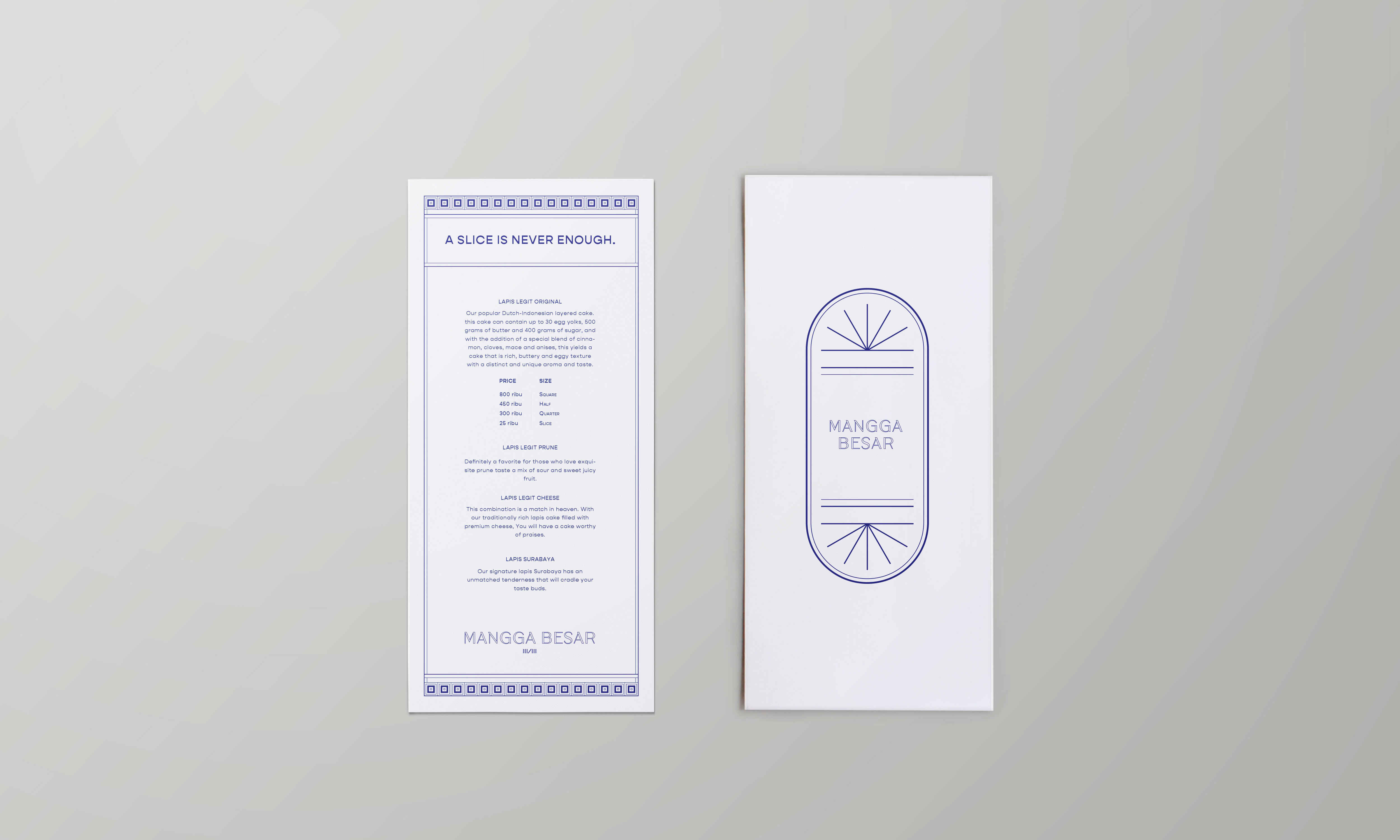
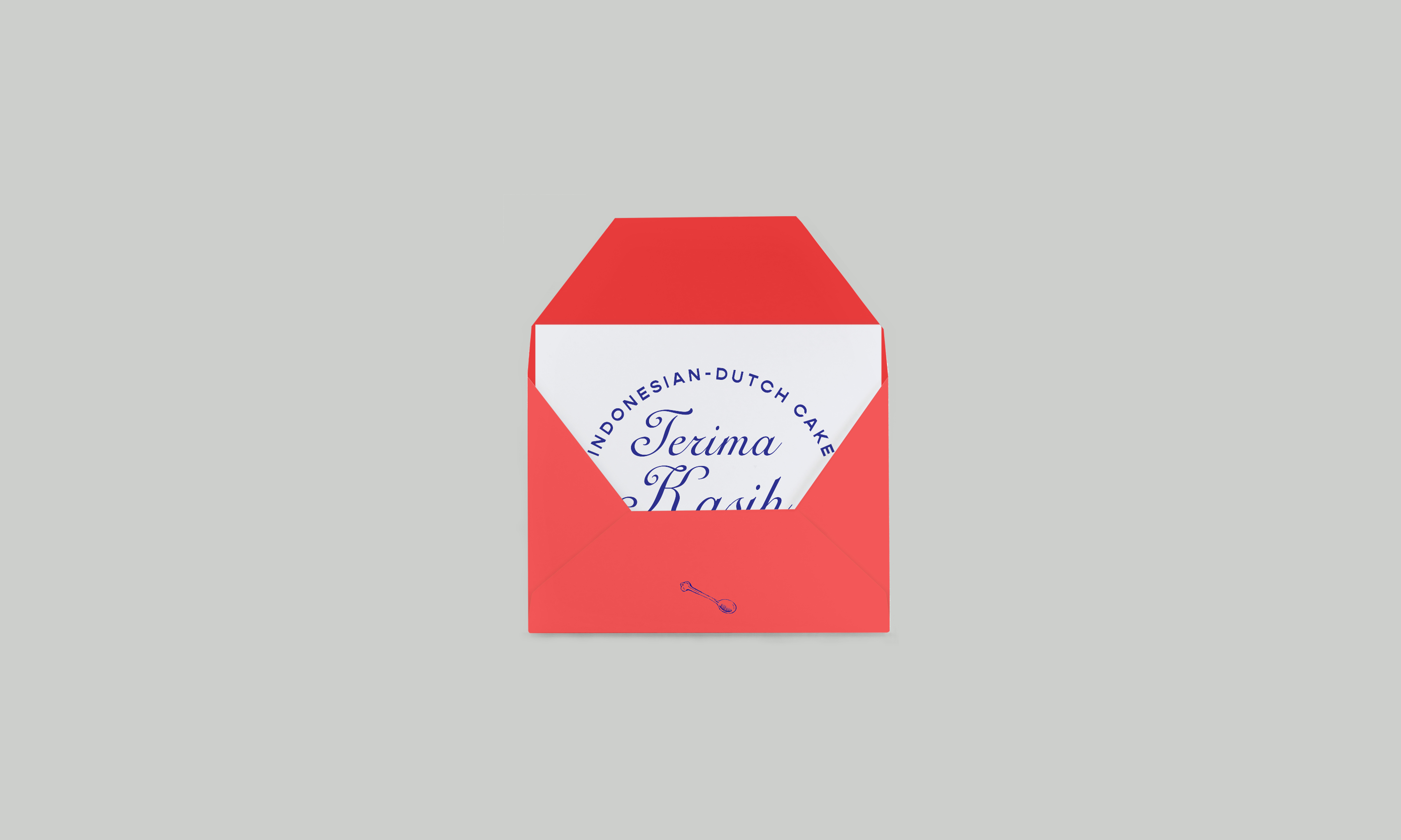
Mangga Besar Cake Shop
Branding, Packaging, Illustration, Art direction — 2020
Mangga Besar Cake Shop is a home-grown dessert and pastry studio. They specialize in a popular traditional Indonesian - Dutch layered butter cake. They have been baking since 1992 but making their debut in 2020.


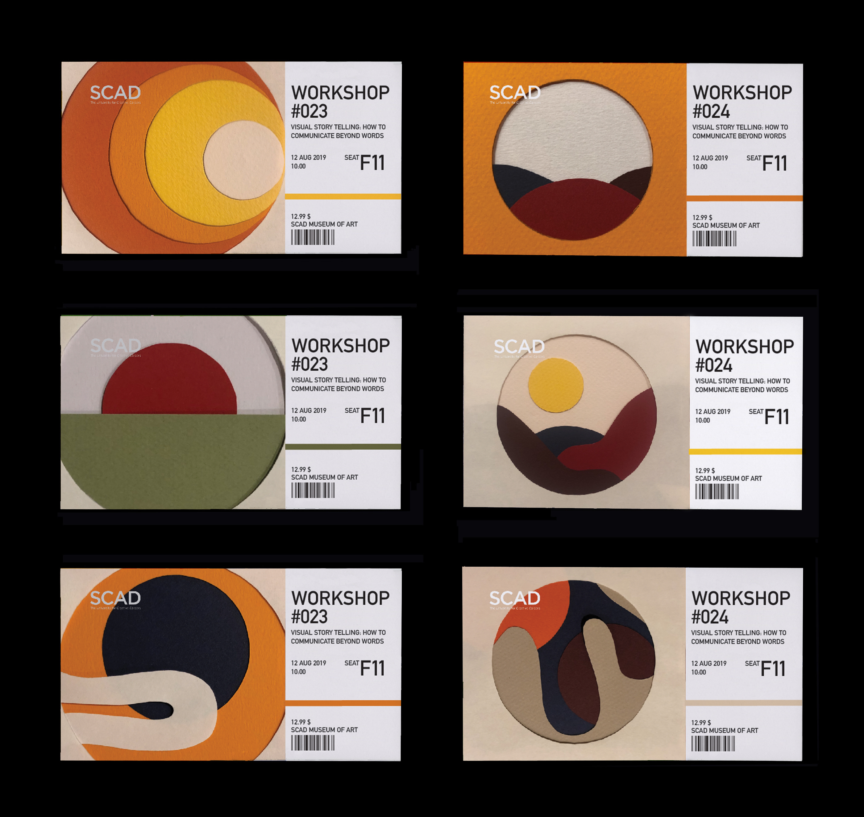
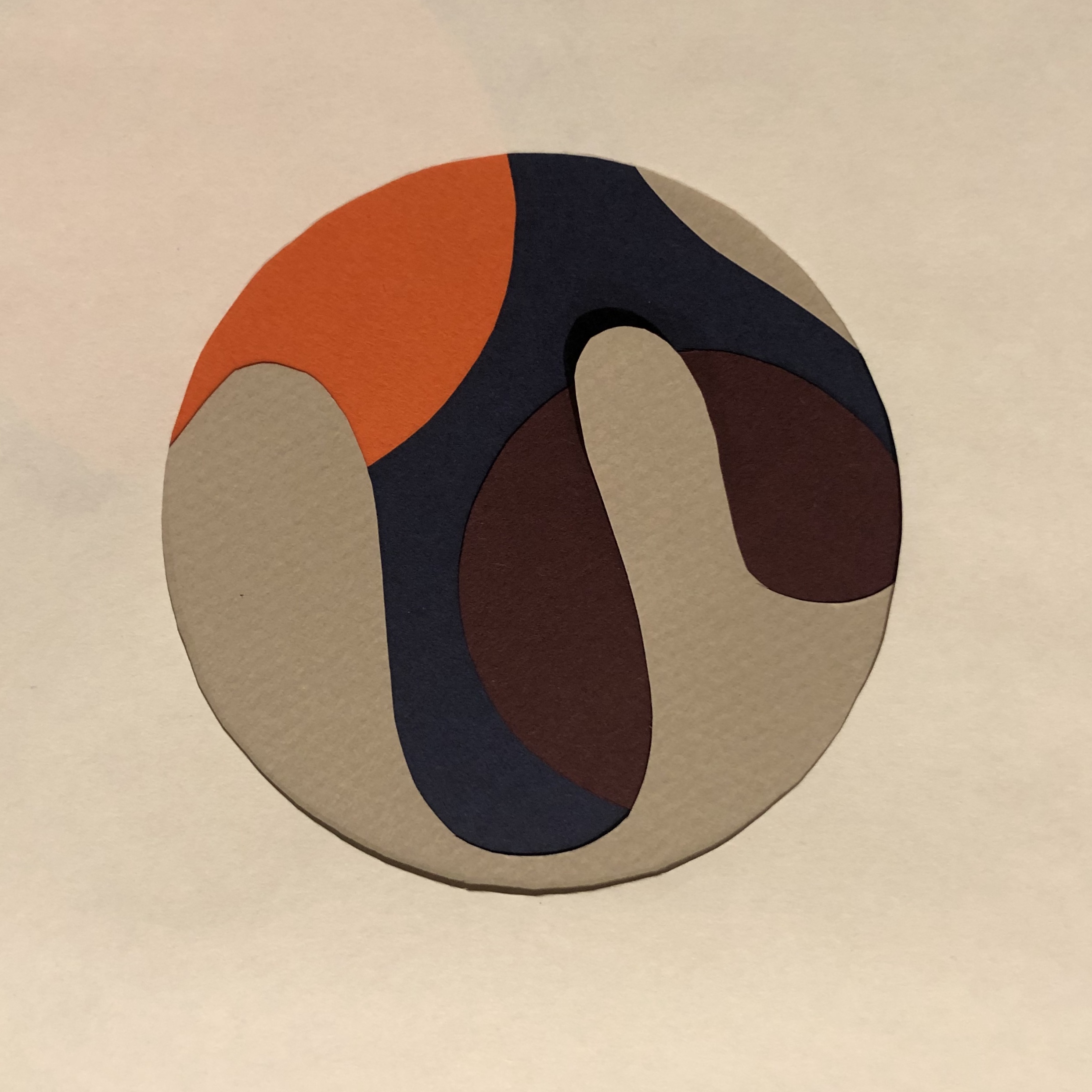
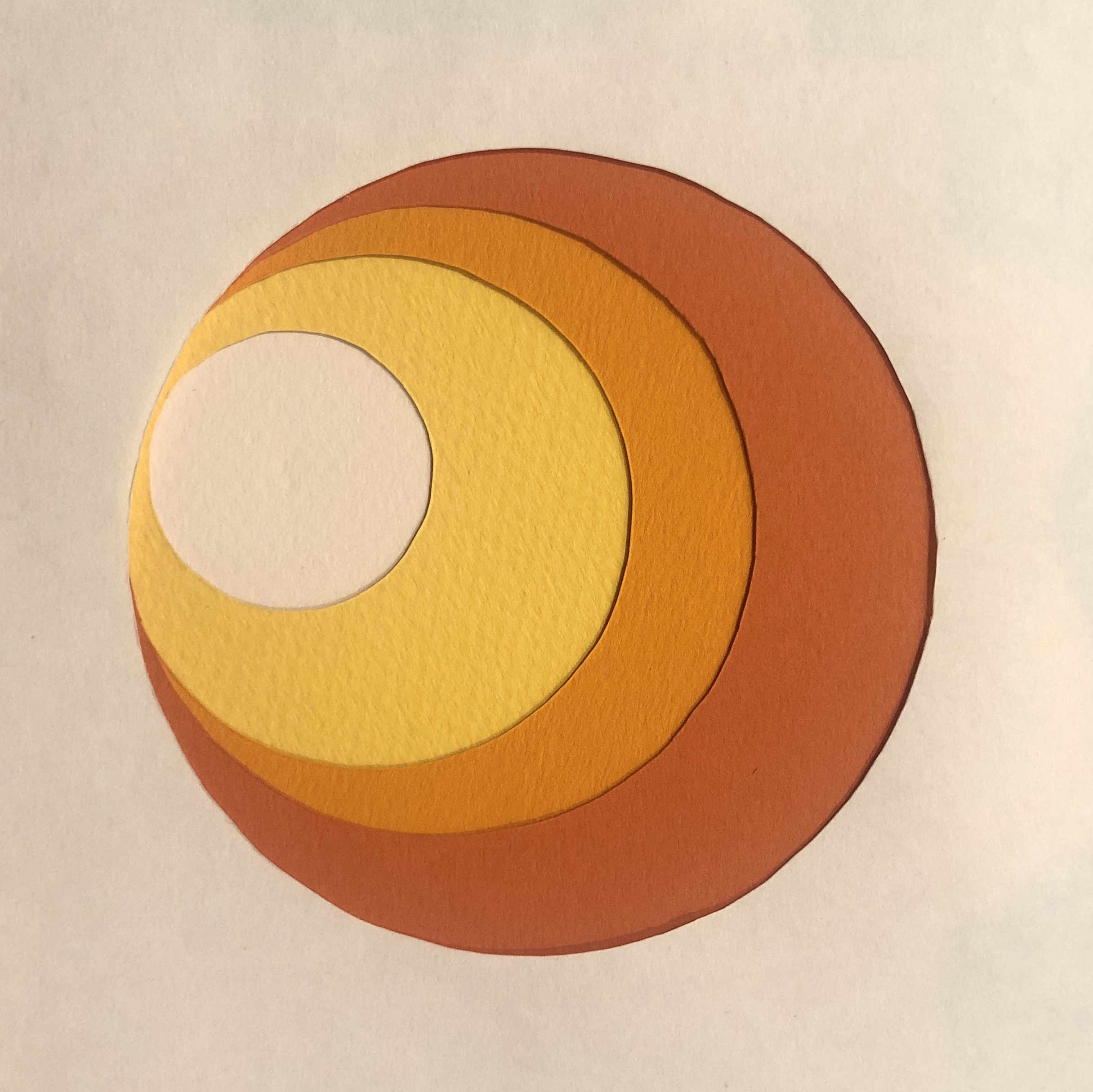
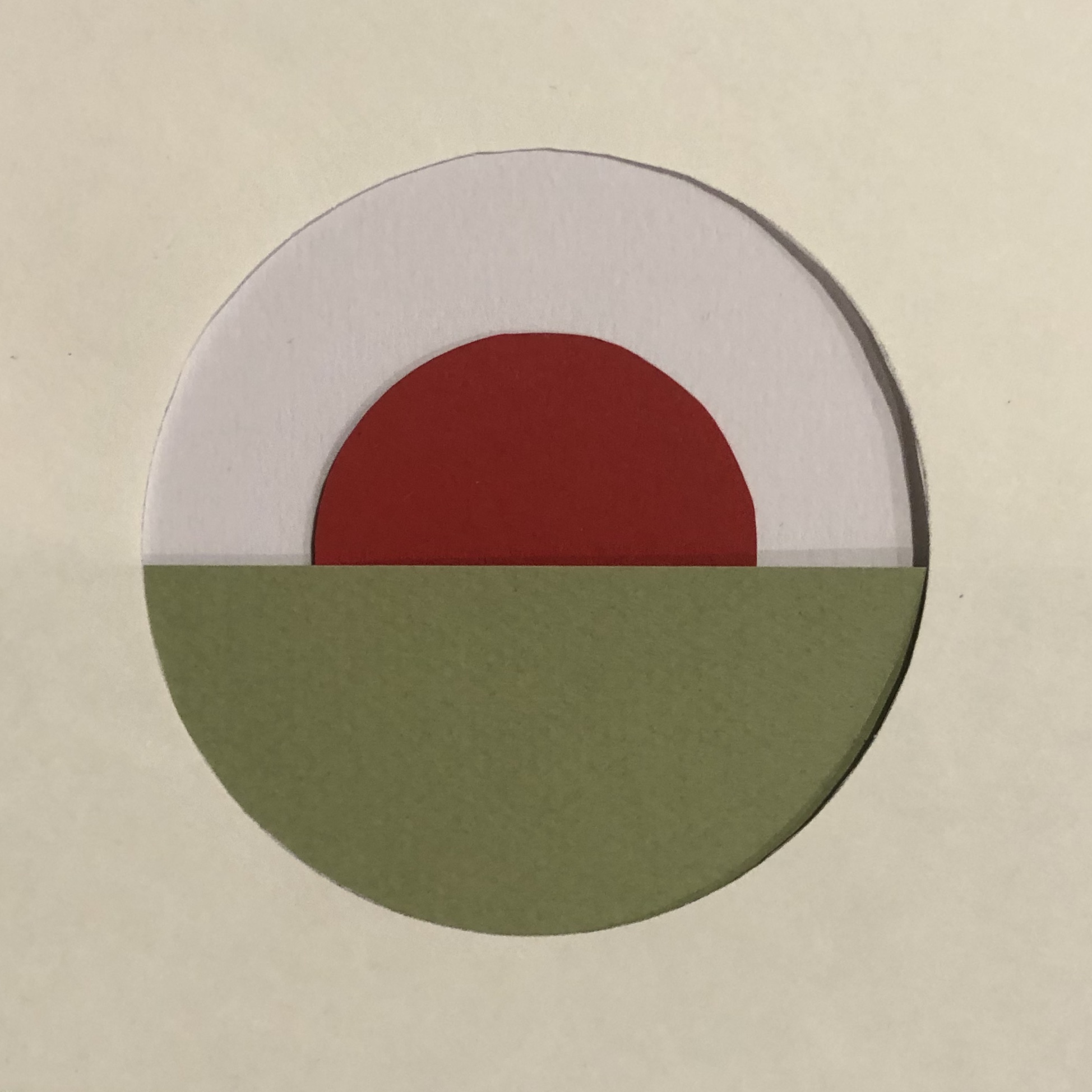
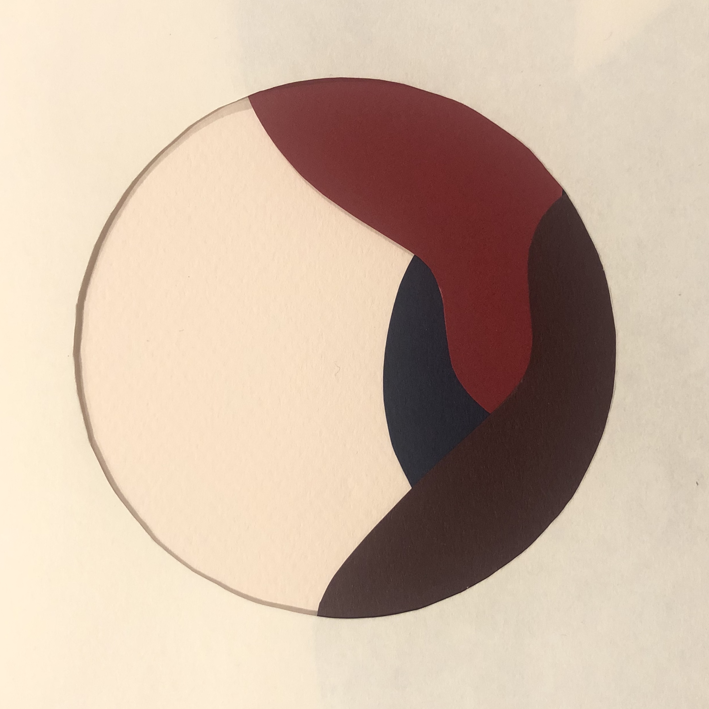
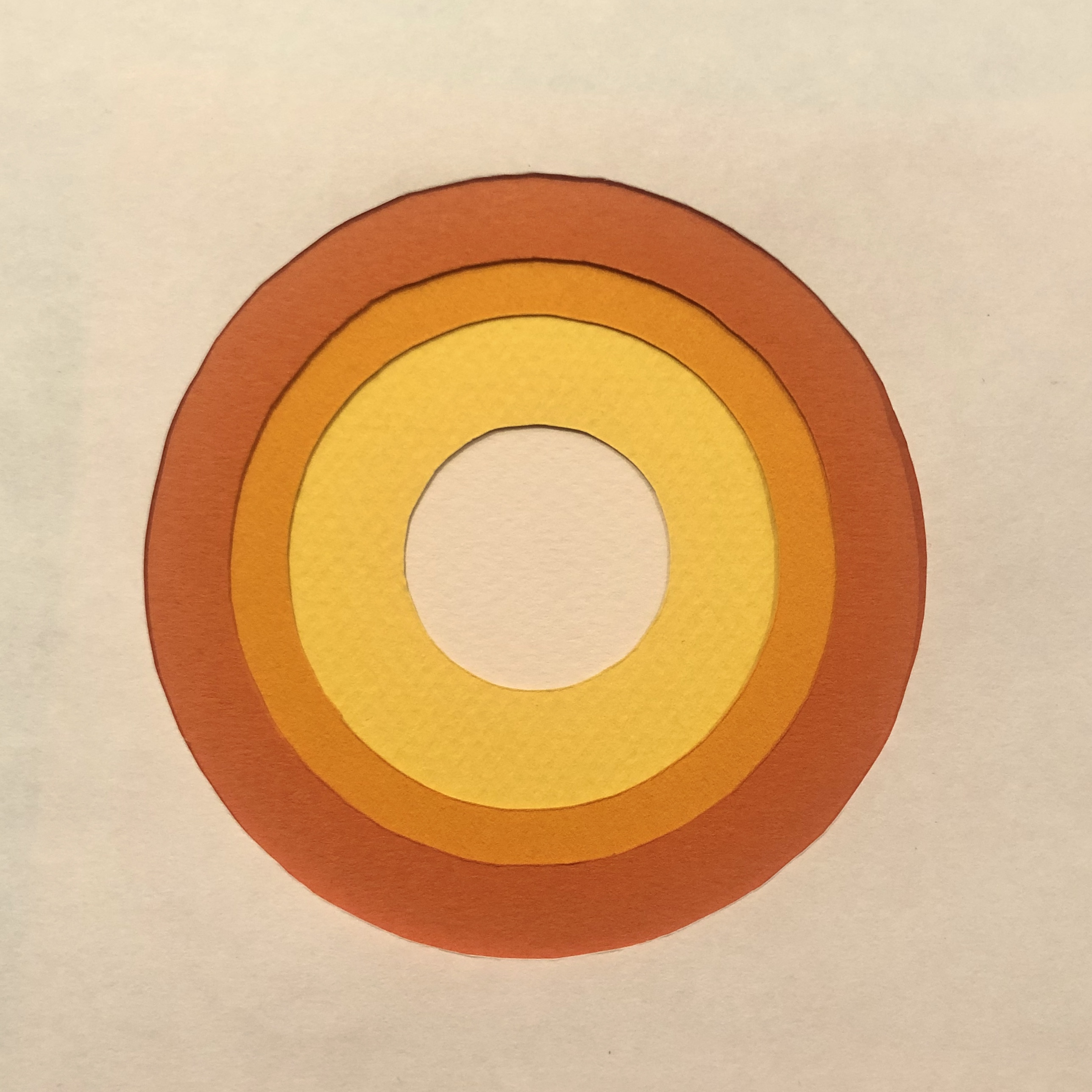
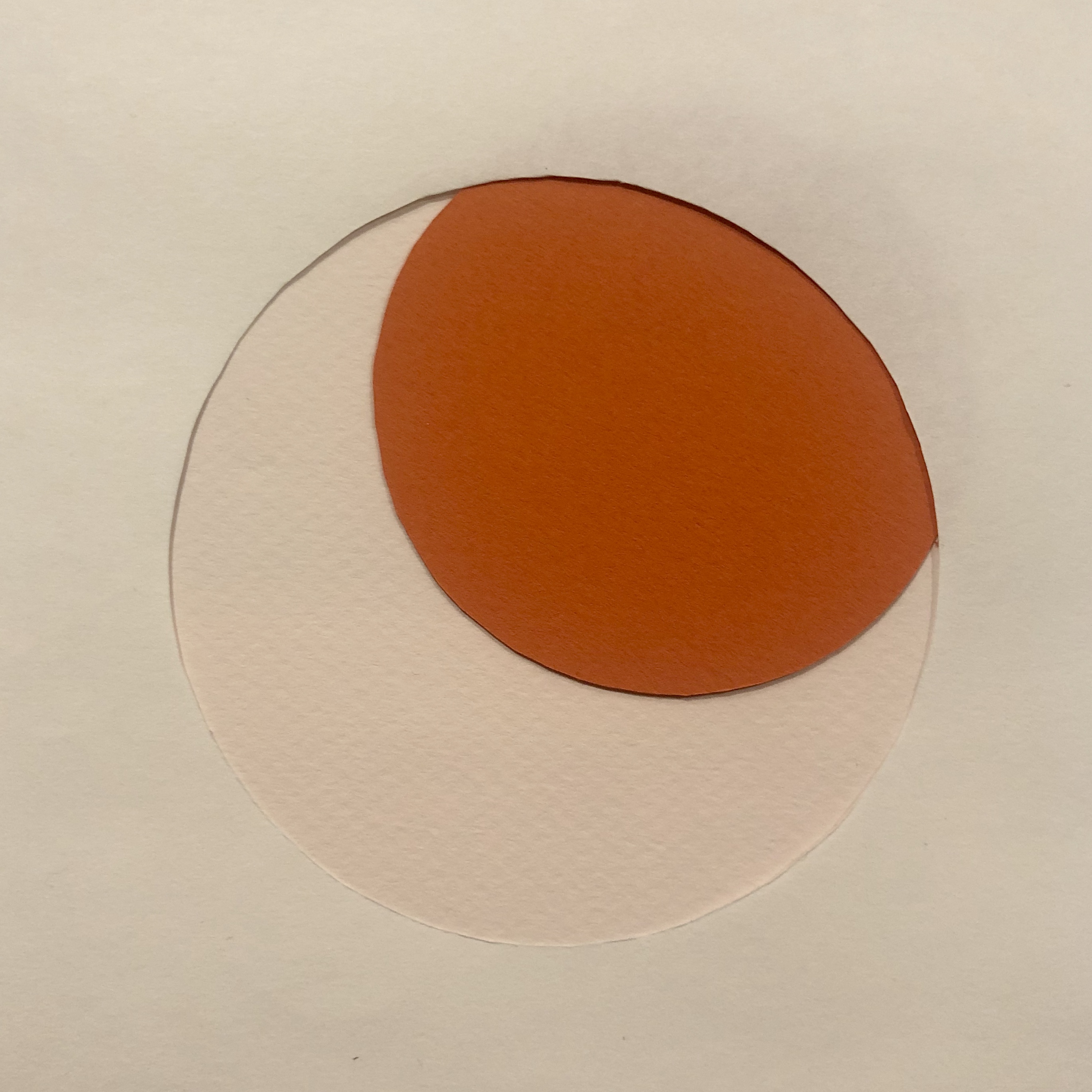
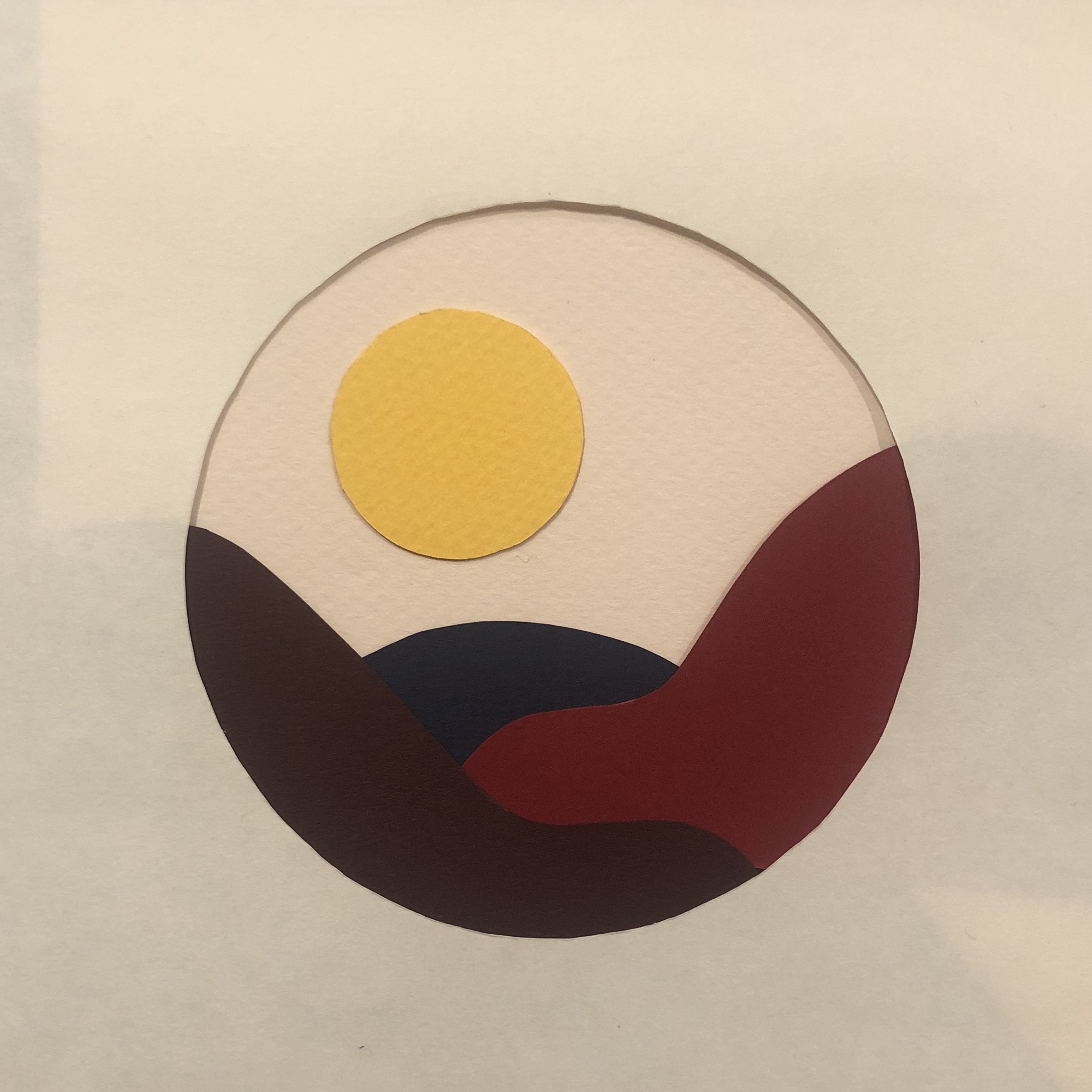
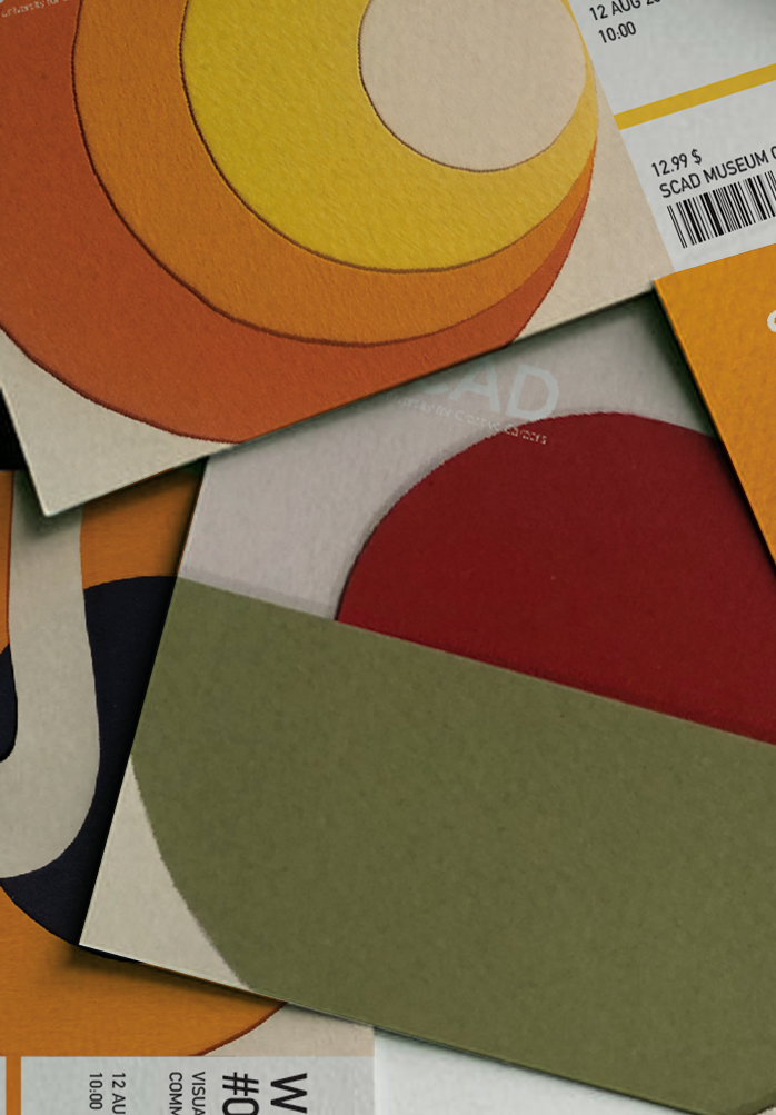
Scad Summer Workshop ‘19
Print — 2019
For SCAD’s annual workshop (conducted monthly), I was asked to develop a visual system for their physical tickets and merchandising. This series was meant to represent the changing seasons the tickets were meant to be used for, while using a practical method, actual collages that were then scanned and layed out for the ticket.


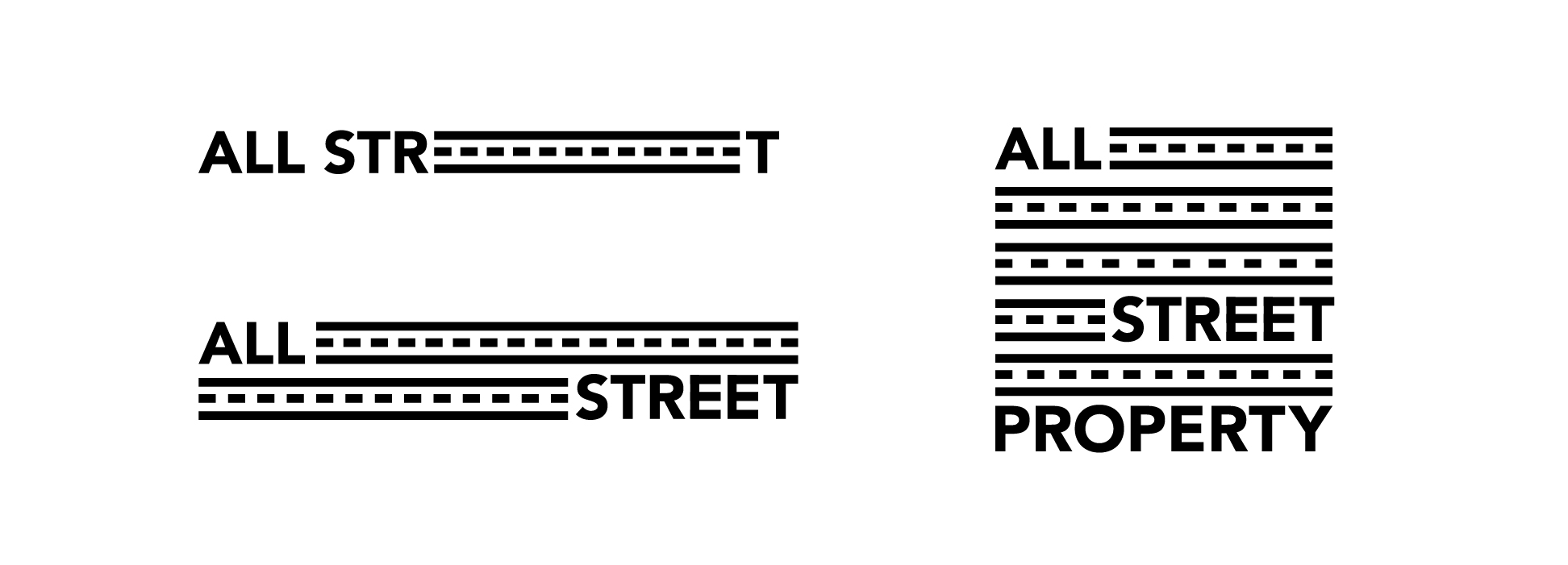
All Street Property
Art Direction, Branding, Illustration, Print — 2019
The new, disruptive real estate company focused on
investing in and renovating existing older properties based out of Jakarta,
Indonesia All Street Properties.
Wanted identity, iconography,
and marketing collateral. A new company started by young professionals, the
focus was on creating something that looked contemporary, but still elevated,
as they service a higher end clientele, and price point.


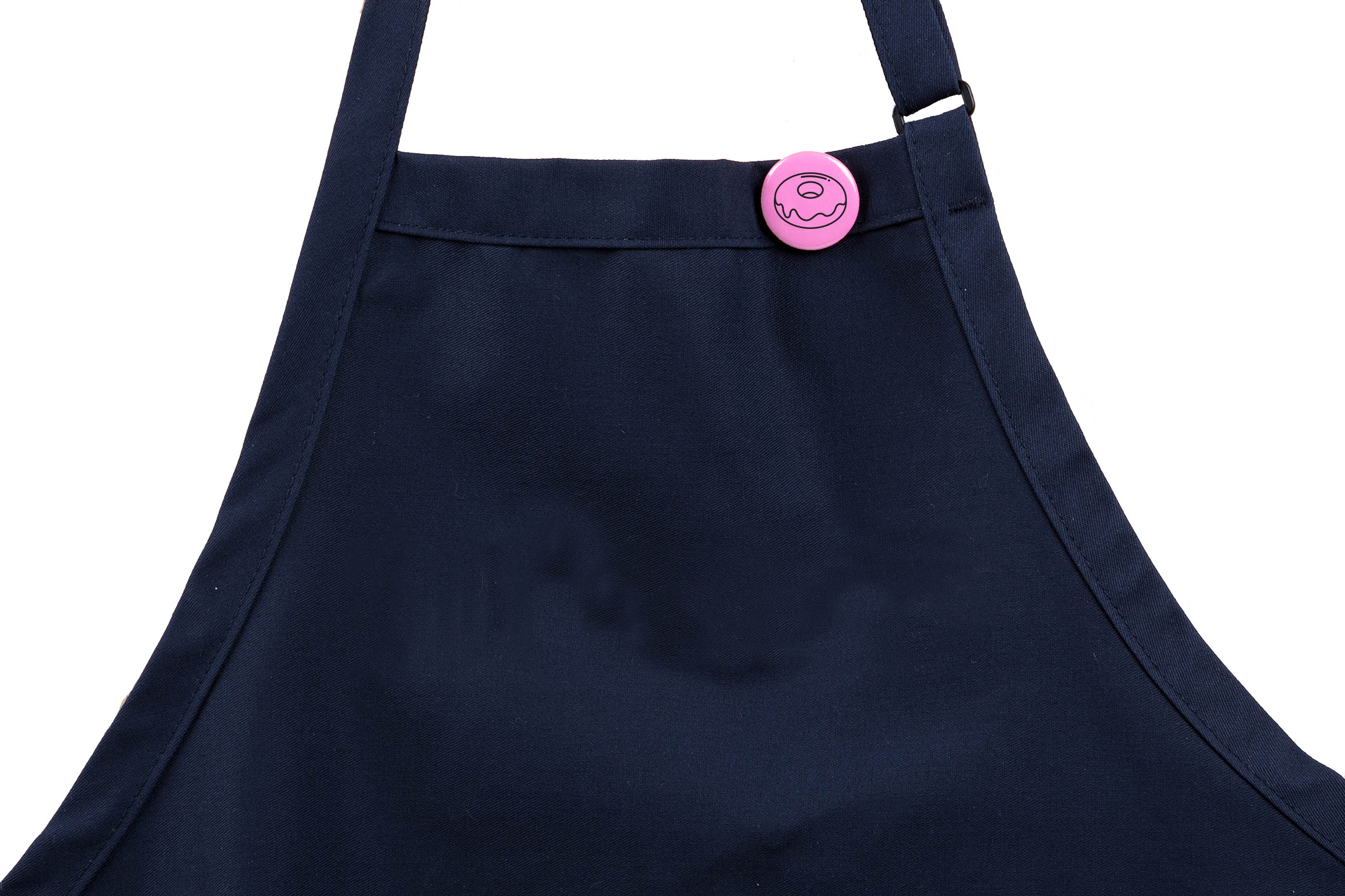
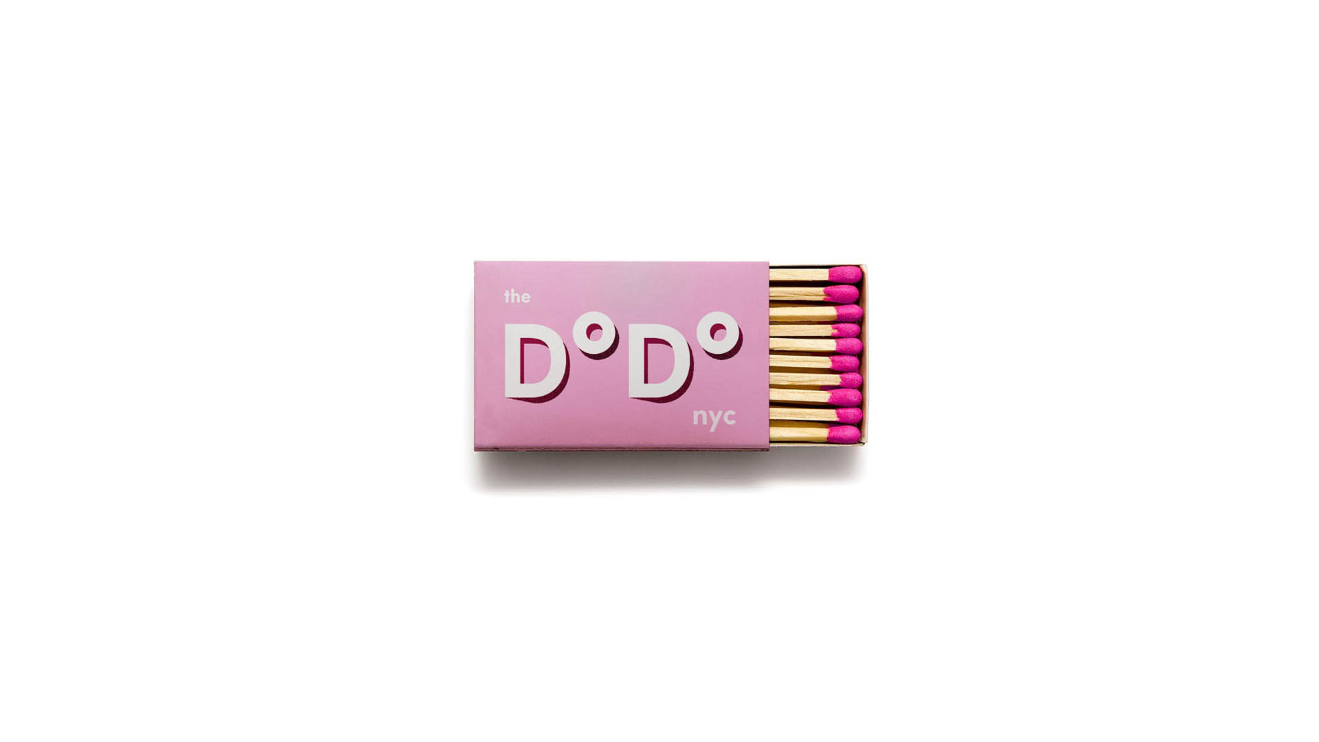
 Dodo Donuts
Illustration, Branding, Packaging — 2019
This work for “Dodo Donuts” is a study of original brand and identity work for a fictional doughnut shop out of the East Village in New York, a neighborhood near and dear to my heart. Their brand identity includes a full range of original illustrations used across packaging, stationery, and merchandise that (hopefully) sits between vintage and modern inspirations, while still feeling contemporary in its execution.
This is specificaally reflected within the geometric sans-serif characters of the logotype, the simple, playful doughnut iconography, patterns, and the straightforward application of these assets.

︎The packaging was designed with two colors to allow flexibility and the ever changing flavors that are made and sold at Dodo Donuts.